Friday, January 31, 2014

Let's Take A Closer Look, Shall We?


I know what you're thinking.  You're saying, "Gosh Kev, it's been days since you last posted an insightful and eloquent commentary about Norman Rockwell.  What took so long?"

Well, first off-- you're welcome.  And secondly, February 3rd marks the one hundred twentieth anniversary of his birth in 1894.  Since he's been in the news recently with the selling of one of his masterpieces for 46 million dollars, and had a bad book written about him, I thought I'd take a moment to show why I like the guy:

Say what you will about his impact on American Art, he was a great painter.  Don't believe me?  C'mere, I'll show you.


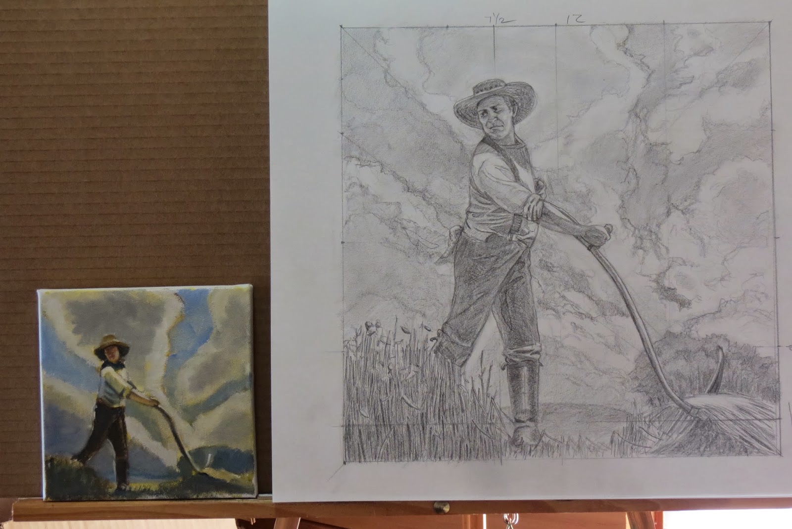
The above advertisement was for a little mom-and-pop telephone company named AT&T.  In 1949 they commissioned him to portray a lineman in the act of stringing wires.  Back then, telephones were connected by wires.  How archaic!  Anyway, it was a simple enough project; One lone guy against a nondescript back-drop.  Just a typical, run of the mill assignment for any illustrator.  The painting looks like this:


You can already see the differences between the poor reproduction of the ad against the painting. Illustrators got paid for the ad, but not for the size of the painting.  Most of them would probably have used cheap illustration board for this ad and made it relatively small, say 24X36 inches or even smaller.  After all, the image was only going to be seen in newspapers and magazines. Rockwell, though, painted this (as he did almost all of his work) on premium Belgian linen.  And he made it huge.  The actual painting is five feet by three and a half feet.  It was common practice by most illustrators to ship off their finished pieces to the client unframed.  Again, it's not going to a gallery or anything, so what's the point?  Not Norman.  He always had his paintings framed before he sent them off.  He felt it made a greater visual impact to the art editor, and thus would get him more work in the future.

Apparently, it worked...


To get this scene, AT&T set up a telephone pole, and supplied the worker.  Rockwell's photographer set up below and took photos at Rockwell's direction.  The first posing session was in early spring.  Norman came up with a design for the painting, but apparently either he or AT&T wasn't happy enough, so that summer they did it all over again.  That meant all the work he did earlier was out the door, and he had to start from scratch once again.


Next came the painting.  If you are ever in New England, take a trip to the beautiful Berkshire area of western Massachusetts and visit the Norman Rockwell Museum.  Not only is this painting there, but even better-- they let you take photos!  Recently I visited there and took full advantage of that policy.  (Don't forget to click on these up-coming photos for an even larger view.)

One of the knocks on Rockwell was that he used photos in his work.  The feeling was that all he did was copy them.  In truth those photos were not only in black and white, but they were rarely the entire scene.  He pieced them all together from the collection of specific shots; an arm, then a leg, then a foot, etc.  Rockwell then added his brilliant sense of color.  Take a look at this segment of the painting:


See how the man's face is seemingly a monotone shadow?  Let's look closer:


He didn't get those colors from a black and white photo!  It is a bit blurred, and that's not because of my photography, but because he didn't want a lot of detail in this face.  But rest assured that if he had wanted detail, he would have had his photographer do a close-up.  At that point in his career Rockwell never did "Good enough..."


Now, when we look at that ordinary plaid coat the lineman is wearing, it would seem rather a simple thing to paint, wouldn't it?  I mean black and red.  How tough is that?  Here's how Rockwell treated that coat:


A technique that he used very effectively almost all of his life is called Variegated Color. It isn't just slapping all kinds of different colors around, but breaking up the main color with various harmonies and compliments. Here he used thick, juicy impasto paint with every shade of red, orange, pink, brown, black and blue you can think of. Absolutely marvelous!


Have you ever stood beside a telephone pole?  Its bland weathered grey wood seems rather featureless.  How would you paint it?  Here's how Norman handled it:


Can you see the thick clumps of color applied with a trowel?  This is another example of Rockwell using variegated colors.  Here a grey telephone pole is a wild array of ochres, greys, browns, reds and blues.  Did he need to do this?  No, not for an advertisement-- but yes to make it Art.


Speaking of variegating colors, check out how he treated the lineman's simple brown leather belt:


My word-- are you seeing this?  From a distance (and scaled down to a photograph) it seems brown enough.  But this belt is anything but brown.  Since brown is a tertiary color, Rockwell broke apart the colors that combined make brown.  That, my friend, is how you bring a dull little detail to life.  Oh, and don't forget that bolt sticking through the pole; it too is filled not only with detail, but life.


Now, the object of this commission was to show some fancy, high tech gadget that AT&T was trotting out.  They were very persnickety for him to show it in beautiful, but exacting detail:


I'd say another job well done.  (And I didn't even mention that spectacular apple tree he painted!  It's as good as any branch that Andy Wyeth drew).  All in all, there were eleven changes that AT&T had Rockwell make before they were satisfied.  Of course, that doesn't count how many changes Norman made until he was satisfied-- all the while knowing that most of the nuance he imparted would be lost in the printing.


It's this seemingly simple painting for an ordinary advertisement that makes me want to bow down in front of it and say, "I'm not worthy... I'm not worthy!"  The amount of effort and attention to detail-- while still making a beautiful piece of art-- is breath-taking. 

THAT'S why I am a fan of Norman Rockwell.


So happy birthday Norm!  The good may die young, but the greats like you will live on forever.


.

Tuesday, January 21, 2014

Falling In Love With Love


Everybody knows a "Debi".  She was engaged to be married to Doug, who was a real nice guy.  But the concept of a lifetime of marriage and devotion never entered into Debi's head.  We all knew what she was more in love with:

The Wedding.

Every topic of conversation was a kick-start for her to bring up The Wedding.  "Gee, I hope it's not raining like this on The Wedding!"  Or, "Oh, I hope it's a beautiful day like this for The Wedding!"  She talked non-stop about the planning of The Wedding;  What napkins to order, the flowers the bridesmaids would use, the invitations, the booze at the reception-- it was all about The Wedding.

Forty-eight months after The Wedding came the inevitable Divorce.


I will admit that when it comes to planning paintings, I am Debi times ten.  I thoroughly enjoy doing prep sketches.  I relish dwelling over the design.  I delight in thinking about how great I can make my idea.  It's not the marriage that's exciting, it's The Wedding!  Anyway, it's OK to snap a photo of a nice scene and make a painting from it, but I have to say my passion is to try and make a realistic painting from my imagination.  It's not easy, and it takes a ton of planning and preparation, but that's why I love it.  Take the picture I'm working on now, for instance.


I love history.  The vast majority of my landscapes might be scenes from today, but I hardly ever put modern elements in them.  I'm the old barn, rock wall and open field kind of guy.  Could it be today, or one hundred years ago?  Every once in a while I get the itch to do a straight-up historical picture.  I've wanted to paint a farmer haying a field for quite some time.  I would look longingly at my antique hay scythe and try to drum up an idea, but no luck.  Last week as I was finishing up a painting, the idea came to me.  I set up a mirror, grabbed my scythe and did this:


In case you don't know what this is, it's a guy haying a field with a scythe.  My idea was to have a semi-worms eye view of this guy coming at you silhouetted by the clouds of a hot summer day.  This sketch grabbed my attention.  I then went to the interweb to view videos of people scything hay so I could be sure I got the posture correct. 
 
Yes, everything is on the web!
 
 
Realizing that my mirror image had put my man in the wrong direction, I just reversed the photo to this because a right-handed hayer will throw the hay over to his left:


OK, now I needed someone to pose for me so I could get the proper view.  Often, I will take a photo of me posing, but I knew the camera perspective wasn't going to be as accurate as I needed it to be.  So I used my buddy Jim:


I did use photos (obviously) for wrinkles and such, because Jim's old, arthritic back wasn't up for long poses.  I did do a thorough drawing of him, though.  He thinks I made him look fat, but I reminded him that charcoal adds twenty pounds...  So anyway, putting all the info together, I drew up a 12X12 inch preparatory drawing:


I used all that planning and design stuff on this.  I want the clouds to kind of swoop down to the blade in the lower right corner.  I intend to give the blade a sparkling sun-glint, so I put a far off stand of dark trees behind it to make it more obvious.  I love doing these drawings because I can monkey with them to my hearts content.  If the whole thing blows up in my face, all I've lost is a piece of paper and cheap charcoal. 


The painting will measure 24X24inches.  So I needed to size the drawing up to get it on the canvas.  Lucky for me, I have a large screen HDTV in my studio I use as a monitor for my computer.  It has a 37inch screen, so I took a photo of my drawing, then blew it up on the screen to 24inches.  From there, I took some tracing paper and copied the drawing.


After that was done, I smeared soft charcoal all over the back of the tracing, then re-copied the whole thing onto the canvas.


I gridded the whole thing so my reference points would line up correctly.  Taking a break from all that, I also took a moment to do a quick color sketch.


Sure, it may not look like much, but it gave me a good idea of how I want to approach my color scheme. 


Now that I had the drawing lightly traced onto the canvas, I went back over it and redefined the entire thing.  I tweaked a leg here, I changed the scythe a scosh, and I noodled the sky a tad bit.  Now the canvas looks like this all ready for paint!


Now that the planning is just about done, the next thing is the walking down the aisle.  I know everything is going to be perfect and just like I always dreamed!

Just like Debi's Wedding...

.

Thursday, January 16, 2014

Look At The Fish!


Louis Agassiz was the most renowned scientist of the 19th Century.  One of his favorite maxims was the best way to learn was from observation.   He was so well respected and famous that students from all over the world made pilgrimages to study under him.  One student recalled that Agassiz put him in a room alone with a smelly dead cod and said simply, "Look at the fish."  After several hours Agassiz came back in and asked the student to tell him about the fish. 

"Well, it has scales, and some fins..." stammered the student, but Agassiz cut him off.

"You are telling me what you think you know about it.  Look at the fish!" Agassiz exclaimed, then left the student alone with the fish for several more hours.  When the great scientist returned, the student was able to go into far greater detail about the fish once he had laid aside his pre-conceived ideas about what he thought he would see.

What on Earth does that story have to do with the Norman Rockwell Saturday Evening Post cover from World War One?  A lot.


If you are going to read only one book about Norman Rockwell, do yourself a favor and do not make it American Mirror by Deborah Solomon.  Her agenda  thesis behind her writing this is to show how Rockwell was a closet homosexual leaning toward pedophilia.  She asserts that his repressed impulses are hidden in his art. 

Yeah... What?

The author is an art critic who has spent the vast majority of her life telling us what to think in regards to the unintelligible drips and splatters that comprise late 20th Century art.  And it's a good gig; Who's gonna say you're wrong if you write some mumbo-jumbo about some smeared paint on canvas?  But the more one does that, the more one can fall into the intellectual vacuum of inserting one's own emotions instead of the artists.  It's a Rorshach Test approach to critiquing.


( "I see butterflies kissing!"  "I see an angry Mommy coming to beat her child over spilt milk...")


The problem starts when you try the same mumbo-jumbo on paintings that are meant to be painfully obvious.  So, in Ms Solomon's interpretation, almost every painting Rockwell did holds some clue as to his repressed homosexuality, because that's what she intended to see in them to begin with.

Let's be honest; That an artist could be gay should come as no shock.  (Paging Mr. Michelangelo...)  And to imply that one is gay should be met with the Seinfeld Defense: "Not that there's anything wrong with that!"  But it's the author's claiming that Rockwell was attracted to little boys because of his gay leanings speaks more about her mindset about homosexuality than anything Rockwell painted.  To her, if one is Gay, then one is naturally a pedophile.  Don't they go hand-in-hand?  Her "proof" behind her brilliant theory? 

He painted little boys a lot.  And he did it really well...

Yeah... What? 

I mentioned in an earlier post about how Rockwell was beholden to his clients, advertisers and magazines editors for their input.  It was they who dictated what Rockwell painted.  Even when he was given free reign as to his depiction of a subject, the idea almost always came from them first, and he still had parameters within which he had to work.  Remember, Rockwell was an Illustrator, not a Fine Art Artist. 

Needless to say, Rockwell's family-- who cooperated with her for this book-- are very unhappy.  Fellow Rockwell fans and scholars are calling Bullshit on her bat-shit crazy idea.  Personally, I'm not going to go deeply into refuting charge after ridiculous charge.  I'll give you two paths to follow if you are so inclined.  One is this excellent article, and this one is a follow up.


I'm going to talk about the fish. 


Look at this painting again:


In Solomon's world here's proof of Rockwell's homoerotic tendencies.  What do we have here?  Two Navy guys-- and really, aren't all Navy guys gay?  I mean it goes without saying.  What are they doing?  Obviously fondling each other.  One is evidently going to be the "Pitcher" and the other one will definitely be the "catcher".  You can tell this by the loving caress the gay sailor on the right (the one with the pretty bow) is giving the gay bloke on the left.  Good Lord, how obvious does Rockwell have to make it?

No.  Look at the fish!

The sailor on the right got a letter from his girl back home.  See the envelope and picture he's holding?  You can tell she's a girlfriend (or wife) -but not just a friend- from the lipstick kiss next to her picture.  The sailor is so lost in his reverie about how much he misses her, and all the fun they had, that he forgets where he's at and who he's with as he gently touches his friend's knee-- as if he were his lady love.  His friend is a big, tough, lantern-jawed old salt whose twice the size of his little friend.  His machismo is evident in his tattoos and his pipe smoking.  He looks down at his friend whose hand is on his knee with a "Dude, you better get your hand off my knee quick!"  attitude.

That's the joke!  And that's all it is. 

Maybe Rockwell didn't quite have the chops this early in his career to pull off the perfect facial expressions to drive his point home.  But he did give the picture enough clues to let us know what is going on.  All we have to do is look.

Deborah Solomon could have stood a lesson from Louis Agassiz.

.

Wednesday, January 15, 2014

Modernism


Ice Storm


I have never let it be a secret of my disdain for Winter.  It is bone chilling, nose freezing, eye watering, feet freezing cold.  Yeah, you can keep your muffs, mittens, skis and Ski-Doo's and leave me my golf clubs and a freshly manicured park of green grass to hit and chase a golf ball anytime! 


But I will also readily admit that Winter has it's moments of beauty.  I do enjoy a pristine field of un-marred new fallen snow.  Or the tender pastel colors that play upon it as the sun rises.  I am arrested by the sight of sunlight glistening and shimmering like a million prisms through ice coated branches.  But eventually the field becomes broken up by snowmobiles and dog tracks.  The roads become lined with dirty brown ice-sludge.  The ice on the trees melts away, leaving the stiff grey branches silhouetted against the cold blue sky like a hand reaching out from the grave... 


So what I have tried to show in my latest painting is the Beauty and the Beast, shall we say, of Winter.  That lovely blanket of pristine snow, the beautiful colors of the ice;  all about to be swept away as a plow comes rumbling through the scene.  My beautiful partner Ellen mentioned to me that this is the first time I have ever put a telephone pole and wires into a painting.  It's also the first non-horse conveyance I've painted, too. 

I guess it's my nod that life has progressed beyond the 19th Century.


Another thing about this painting is the technical part.  Yes, I saw this scene (without the plow) and took several photos, but I actually planned out each element.  Here's the concept drawing:


After that came the color study, etc...  Notice however that I don't have a plow in this drawing?  I noticed early in the actual painting process that I had fallen upon an old bad habit:  I lead your eye to... nothing. 

I did a post recently about studying design and all that, and one of the things that slapped me like an open hand on my forehead was the necessity of leading your masses to the point of interest.  Now, that sounds like a no-brainer, doesn't it?  But I really only had the "lead your eye" part down.  I'm pretty good at arranging a painting to keep the viewers eye inside the frame, but I was inconsistent at leading them to a specific spot.  That's where the snow plow came in.  All the lines and angles in this piece keep you inside the frame and bring you to the center-- but I had nothing there!  So, I put in the plow.  And in doing so, Voila!  Now I had a reason for the painting instead of just another pretty, but innocuous scene.


Could it have been a sleigh, or a cross-country skier?  Yeah, but then it would have looked old-fashioned, and I'm all about the modern...


.

Wednesday, January 8, 2014

Hitting The Books


I remember well when I was just a wee laddy in school.  To say I was a poor student would be like saying the Pyramids are a pile of rocks in the desert; Accurate, but woefully understated.  I thought that diagramming a sentence was just like deciphering hieroglyphics.  Math was like Greek to me, and science like Latin.  (Which most of it actually is, but you get my point).  I'll never forget my favorite teacher, Mr. Jones-- or maybe it was Mrs. Palmer, whatever-- sat me down and said words that have stuck with me all my life:

"Maybe this whole book learning thing isn't for you.  Have you thought about taking up art?"


Since then, I have been on my journey to teach myself a thing or two about painting pictures.


Now, I've mentioned more than once about my being self-taught and all, but I don't recall saying how I go about it.  It's kind of like the way I taught myself to play the piano:  Keep hitting notes until you figure out where the right ones are.  Same way with painting.  I set out to teach myself painting by mixing paint and slapping it on until it started to look like something.  It's the sledgehammer at a concrete wall approach, because God forbid I actually looked for instruction on how to do it. 


Nowadays there is lots of instruction out there; Art School and Ateliers.  DVD's.  How-To books and magazines by the score.  Personal instruction and workshop's from proven Pro's.  Or, the way I do it: Study Art and Artists I admire and try to learn from their work. 

Over time I have noticed three commonalities in the really good artists.  One is great drawing ability.  The other is beautiful color sense, and the third is impeccable design in their paintings.  (The unspoken fourth is Talent, of course.  But you gotta be born with that.  Thankfully you can learn the first three).  Anyway, I figured there must be some kind of principle to follow to make a great painting.  I learned enough by studying those artists to recognize and try to incorporate effective design and good color in my paintings.  But alas, knowing a principle exists is not the same as knowing precisely how to do it.  If I am being honest, I have to admit that when a painting of mine exhibited the attributes I just stated, it was because I was lucky enough to combine those elements, as opposed to purposely imparting them into the picture. 


I knew I needed to learn a lot more, and looking at pictures or slapping paint wasn't going to be enough.  I mean there's only so much dubbing around you can do.  I have always disliked How-To books because I've always been interested in the Why as well as the How.  Somewhere, there must be something I could read that would explain those principles.   Luck was on my side.


A few months ago, while browsing in a used book store, I came upon this book:


It's not a How-To book by any means, but an in-depth examination on Design principles and Color Theory.  In other words, it was exactly what I needed!  It was published in 1951 for art school students, and while it may be a school book, it reads fairly well.  Most importantly, it showed me that effective design can actually be done without guesswork.  Yeah, who knew?


The other half of the book covers Color Theory.  Now, I'm color-blind and I'm not ashamed to admit it.  However, it goes without saying that I can struggle mightily with my "See the color, Paint the color" approach to painting.  This book shows how to approach color in a more selective and harmonious manner. What that means is that I can use a color scheme that I choose instead of being a slave to what lies in front of me.  It's a good work-around for my lack of true color vision.

If you are interested in this book, (and really, you should be) here's a link.  It is out-of-print, and some copies can be somewhat pricey.  Oh, I got mine for $2.50.  No lie.


While I was on my education binge, I decided to pick up another great book on the same subject of Design and Color Theory.  Andrew Loomis' Creative Illustration.


I've mentioned countless times of my great respect and admiration for the great Illustrators of the 20th Century.  Why I love them is because they were great Artists.  And what makes a great Artist in my book?  Great drawing, great color sense and superb designs.  Loomis was a Master in all three phases.

"But wait a minute, Kev," I can hear you say.  "You paint little landscapes and such, not illustrations."  To that, I say:  "It doesn't matter WHAT the picture is, an illustration, or a quiet landscape, it's how the painting was planned that is important!"  In this book, Loomis goes into great and very readable detail on how to make an effective, dynamic painting.  Maybe, like me, you're not all that interested when he elaborates about the difficulties in magazine illustration as opposed to bill-board adds, but his explanation of design and color makes it all worthwhile.  Luckily for us, this book has been reissued.  Go get it.


One last thought on all this new-fangled knowledge I've unearthed.  After immersing myself in these books, I was able to look at my own work with new eyes.  Instead of wondering where I went wrong, I could see and understand where my problems were.  I could even understand where I went right.  Hopefully, I can get it right a lot more in the future.

Who knew hitting the books could be so informative?

.


Saturday, January 4, 2014

The Good, The Bad And The Ugly Of 2013


Down To The Water.  My last painting of 2013.


You know, we tend to think that most years are memorable in some way.  The year of a special occasion; Births, deaths, weddings, divorces, promotions and new jobs.  We remember those years as important mile-markers on our journey on the road of life.  But in reality, most years are uneventful and unremarkable paving stones on that long road.  2013 (pronounced Twenty-Thirteen) was like that for me.  Nothing spectacular, just a ho-hum kinda year.  Nothing wrong with that.


As I look back on the art side of 2013, (pronounced Twenty-Thirteen) I notice that my production of paintings was down somewhat.  I still go to my studio and paint every day, but instead of cranking out a painting every other day, I was taking a couple of weeks or so to complete a picture.  There are several reasons for my slowing down, but I think the biggest reason was that I was going for quality over quantity.  Fat load of good that did me!


So allow me, faithful reader, to show some of the paintings I produced in 2013 (pronounced Twenty-Thirteen):


The year didn't start out horribly.  I think I did a couple of nice pieces.

First Light, Fresh Snow


River's Edge


After The Storm


Pemaquid Porch


Hugging The Shore
 
 
Then I had a bit of a dry spell.  I painted some God-awful dogs that shall never see the light of day.
 
Like these:
 
 
Harbor Moon


Morning Haul
 

Then, I think I righted the ship as the year started to slip away:


Hanging Around On Fish Beach, Monhegan


Greener Pastures


And then there was this one...


In The Woodshed


Oh, there were more, but I think these are indicative enough of the past years efforts.  The best thing about a year like last one is that there's so much more to look forward to in the next year! 


I hope your 2013 (pronounced Twenty-Thirteen) was a happy one, and I wish all of us in the happy Maine-ly Painting family to have an awesome 2014!


Say it any way you like.

.