Monday, May 30, 2011

Teacher, Teacher!


Looking at my viewer counter, I noticed I have reached the ten thousand mark for the number of hits my blog has received.  So, not counting the number of times I have checked out my blog, that means twenty seven other people have looked at my blog too!  How exciting... 

For those who wake each morning in eager anticipation of seeing a fresh and new Maine-ly Painting post, I apologize for slacking recently.  But, hey-- I've been busy!  I just got back from the Philadelpia, Pa. area where I made a quick trip to deliver some paintings to a new gallery that will represent me.  That was cool.  I've also been giving some instruction to a nice guy who wants to learn how to paint-- NOW!  I feel bad for him, because when he asks, "How do I paint that tree?"  I say, "Keep putting paint down 'til it looks like the tree."  Drives him nuts.  He still thinks there's a direction sheet for painting.  Like putting a swing set together;  Screw A goes into nut G after tightening bolt Q.  That kind of thing.  He doesn't quite get that no matter how good you are, painting is still trial and error.  Granted, if you're really good there's less error, but everyone scrapes off a mistake now and then.

Learning any new skill always reminds me of learning to write.  We spend years in school learning how to form letters, then how to spell words.  Finally, we can write our thoughts without ever thinking about the mechanics of forming letters.  All we care about is what we're trying to say.  My poor student (let's call him Steve, even if his name is Jim...)  is chomping at the bit to write War And Peace, but he hasn't learned how to make letters yet.  So I can understand his frustration.  It also dosn't help him when I say things like, "Make the brush think it's the ocean, " or "Move that brush like it's the cloud."  Quite often when he asks something like, "How do I paint that rock?"  I'll say, "The same way you paint a tree."  Actually, I'm trying to get him to think about values, and highlights and shadows.  He just thinks I'm insane.  Wish he was wrong...


I've given lots of training and instruction throughout my life with the various jobs I've held.  The hardest part is that I'm a bit of a control freak.  I hate to see people suffer when I know how it should be done.  But I had to fight the overwhelming urge to do it myself, and just let my poor trainee do it for themselves.  Trust me, it was harder for me than it was for them.  Learning from mistakes is an effective way to learn.  Steve is always asking for me to paint a passage so he can watch how I do it.  He hasn't caught on that I will do the easiest part, then hand him the brush to finish the harder part. 


I try to not think about the old adage about those that can-- do.  Those that can't?


They watch others suffer and call themselves teachers!


.

Wednesday, May 18, 2011

CSI: Photos Of Paintings


Sorry about whining about the weather in my last blog.  Thankfully, here in Maine the weather has turned.  It's gone from clouds, fog and drizzle to foggy, drizzly and cloudy.  It has also played havoc in my trying to get some decent photos of my recent paintings.  I usually take my pictures in bright sunshine, but the aforementioned weather has precluded that.  I tried to take pictures anyway, but you know it's dim out when the camera prompts you to use a flash even when outdoors at noon!  So I took them here in the studio instead.  The painting above is called Spring Flood, and it shows my back field flooded out by the Eastern River that runs along between it and the trees being lit up by the last fews rays of sunlight.

I recently mentioned in a blog post about my troubles with getting decent photos of my paintings.  I think it's a crime when a good painting in person looks so bad in a photograph.  It got me to wondering why some paintings (usually others) photograph well, and some (usually mine) don't.  I likened it to that sad occurrence that happens to nice people who just take a bad photo.  Like Abraham Lincoln.


                                                               Or Phil Spector.


This guy produced some of the greatest hits of the 60's?  Phil, it looks like you lost that lovin' feeling!  But I digress...


I got to thinking about other possibilities as to why photos of paintings don't turn out very well, and I've come up with a  theory.  Keeping in mind that sometimes it really is an accurate photo of a crappy painting, I think it is all about the range of values a painting has.

You see, a camera is always trying to play the middle, specially when there's a great deal of contrast involved.  Look at this photo of Cundy's Harbor during a gorgeous summer sunrise:


But also note how dark-- almost black-- the fore and middle-ground is.  In reality, the sky was much brighter and more colorful, the trees across the way were a lovely green, and the wharf which was full of yellow, green and blue lobster traps was perfectly visible.  But the photo only shows the sky with color.  That's because the camera lowered the values of everything so that the sky wouldn't be overexposed, leaving everything else super dark.  It can't brighten one section and darken another-- it's all or nothing.  If the dominant subject was the shadowed wharf, the camera would have lightened the values to show those colors, but at the expense of the sky.   Another example is of my local church on yet another glorious summer day.  (Definitely not this year!):


Beautiful sky, but look how dark the trees and shadows are.  When I focused on the church without the sky, it showed the truer values of the scene.


So what does this have to do with photographing paintings?  Well, a camera doesn't know or care what it's taking a picture of.  It treats everything in the same manner, including paintings.  So, if your (my) painting has alot of contrast, the camera will do it's thing and mess with the values.  Which means if your painting has a value range that's mostly high-keyed, or mostly low-keyed, without much contrast you're probably in luck.  If your (my) painting runs the gamut between high and low values, with tons of contrast-- you're screwed.  A camera absolutely hates that lovely deep purple shadow next to a bright golden yellow high-light that you're so proud of.  It'll either over-expose the high-light into a white blob to show the purple, or darken it, turning the shadow into a black hole.  Either way you (I) lose.

I asked in my previous post if I should paint for the human eye or the camera eye.  After all, if you the visitor is pleased with my painting, and you think I did a realistic job, then I did OK, didn't I?  But what is the more likely way you will see my painting?  Online, that's how.  And what is that image online?  A painting?  No, it's not-- it's a photograph of a painting.  So I guess I better keep that in mind when I'm painting, since I don't want my pictures to look criminally bad.  After all, I don't need this guy to come after me--


.

Monday, May 16, 2011

Gotta Love It!


I told myself that I would not use this post to discuss the weather here in Maine.  I mean, nobody wants to read about how this "spring" has been unusually cloudy, rainy and cold.  That since April first we've been rained on forty out of forty-six days.  How shallow is it of me to complain about ceaseless drizzle when there's flooding in the midwest, and massive destruction from tornados in the south?  So I won't mention that today it's raining for the third straight day.  Enough said.  Or that the temperature has yet to crest seventy degrees yet this season.  OK, I'll stop whining.

But according to the Weather Channel's ten day forecast, we're looking at ten straight days of rain with temps around fifty.

I mean it, I'm done now.  I've got it all out of my system.

Wait!  Look out my studio window...  What's that I see?

Drizzle and fog.

What I wanted to mention is that last week a very nice person and wonderful sketch artist from the UK named Katherine Tyrell asked me to contribute to her blog series called Places To Paint with a few words about Maine.  So, gentle reader, if you want to know what I said, please go to her blog Places To Paint and I'll give you a tour of what I actually like about painting here.  Here's a hint:

I don't mention the weather.


Monday, May 9, 2011

Half-Way There And Other Thoughts


I can usually gage when I'm about half-way through a painting-- not by determining how much I may have left to go before I finish, but when I feel I have screwed the thing up beyond repair.  That's the stage I'm at right now with my current project.  It's kinda alright if you stand far enough away.  And close one eye.  Then squint.  While looking through your cupped hand.  While you're upside down and looking at it from between your legs.  With the lights off.  But stand up, turn around, open your eyes and turn on the lights and it's a different story.  I don't think I'm the only one who's felt that way during a painting.  I read once that Norman Rockwell called it the, "My gosh, it's horrible!" stage.  And as I always say, if it's good enough for Norman...


After my recent blog By Definition where I kind of rant about what I think art is not, I was asked by a kind reader what specifics a painting must have to be considered art.

You've seen my paintings.  Do I look like I know?

Actually, I think it boils down to something very simple:  Color and Composition.  Some may throw in Design, but it doesn't roll off the tongue like Color and Composition.  This is what I mean, though;  I think a piece of art has color that is harmonious and pleasing to the viewer and arrayed in a pattern that leads the viewer's eye and engages the brain.  It could be an abstract, or a Bouguereau.  But I still firmly believe that an artist does it on purpose, not accident.  After all, John Sutter found gold in California by accident, and it didn't turn him into a Geo-Physicist.


I just got an email that said I was juried into an event to be held later this summer.  It was followed moments later by another email that said I wasn't juried into this same event.  Ah, the thrill of victory, the agony of defeat...

I'm in, though.


I was looking at a web site that showed the winning paintings of an art competition.  I know I shouldn't really say this, but the one hundred or so works in the competition look like they were all painted by three or four guys.


And speaking of trends in painting; since when did painting edges get the same stigma as letting babies play with knifes?  You know-- it's just not done.  Look, I know the impressionist had their philosophy of blending and softening edges to show roundness of form, and there's nothing wrong with that.  But it seems to me like the basic human fault of trying to improve upon perfection has taken over.  If a soft edge is good, then loose is an improvement.  If loose works, then ragged is great.  If ragged is great than sloppy is-- The.  Best.  Thing.  Ever!


I did a colored pencil of the lighthouse at Pemaquid Point, Maine.  I worked on this puppy for a couple of weeks.  Since it is pencil, and easily smudged, I sprayed it with a fixative.  The problem was that a solid drop of the stuff splattered on the paper and left an ugly dot on the white of the lighthouse!  I don't know what to do with it, but it looks like this-


I guess now I'll have to call it a spot light!


.


Wednesday, May 4, 2011

Foggy Cove


When I was a kid I used to love to make drawings of sailing ships from the nineteenth century.  Big, square-rigged frigates plowing along through wavy seas.  I would show these to my dad who would say, "oh look-- it's a picture of the moon landing!"  To which I would patiently explain that, no, it wasn't that but a big sailing ship.  It's a habit I still have to this day of explaining my pictures in case someone would mistake my sea-scape for an Apollo moon landing.  So this one is of a small cove in Cape Elizabeth, Maine on a late summer afternoon when the fog is starting to roll back in. 

This is a studio piece, I did not paint this on site.  I did take some liberties in depicting the scene, though.  When I was there it was lovely summer day, with no fog in sight, so I put some in.  There is a house up on the shore, a big, looming mansion to be exact, but I simplified it's shape.  In retrospect, I think it would have been more fun to paint it as a tar-paper out house.  You see, the owner of this property has cut off all access to the shore to his neighbors and the general public.  Families used to picnic here, but no more because of him.  So doing stuff like painting the house as a loo is my idea of getting even.  And since I didn't do that, telling the world what a tool that owner is will have to suffice, I guess.

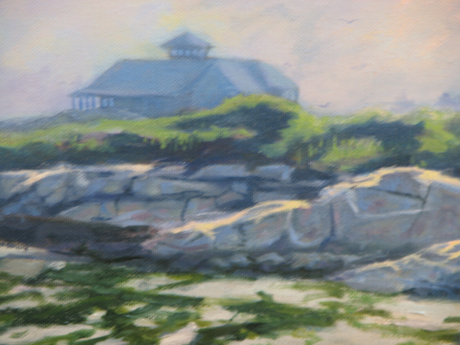
Painting fog can be tricky.  Some may go for a glaze effect over the painting to convey fog.  I went with making the painting look like it was foggy without using any glazes.  Here's a fuzzy close-up of the rocks--


I wanted simplicity and atmosphere, not detail.  One thing about Maine beaches; they are not made of golden sand.  A cove like this has a grey, pebbly sand made from the grey rocks being ground down by the constant wave action.  That's a lot of grey, so I tried to infuse color wherever I could.  As usual with photos of paintings, a ton of color nuance is lost, but trust me, this is more colorful than it shows here.


Being detail minded, I did try for authenticity in my portrayal of sand.  Here's another close up of the kayaks:


And since I can't resist taking things to the extreme, here's a another close up shot of the sand:


...With Neil Armstrong's footprint!


.

Monday, May 2, 2011

That Lying Eye

The lovely Penelope Cruz


Maybe you know of a loved one, a spouse, a brother or a sister.  Maybe it's a co-worker or a good friend.  We all know someone who is quite good looking, yet looks butt-ass ugly in photos.  Conversely, I've even personally met Hollywood stars who were butt-ass ugly, yet were considered one of the world's beautiful people because of how they looked on film.  What gives?  One word: Photogenics.

Cameras don't lie, right?  Photographs only show us how things really look.  Yeah, right.  Not by a long shot!  Because, dammit, my paintings always look like crap in a photo!  Now, that's not to say that quite possibly it's because it's a crappy painting.  But there is something definitely amiss.  I blame digital technology.  I'm no camera expert, but there was something soothing about 35mm that digital pixels don't quite match.  It's like listening to an analog phonograph;  The sounds blend in a pleasant, warm tone.  Now listen to the CD version-- the notes are there, but it's harsh-- almost too pristine, if you get what I mean.

Everyone has heard of the general rule of thumb that a painting is best observed from ten feet.  That's to allow all the colors and brush strokes to blend together in our eyes and form a convincing image.  Digital cameras don't allow that to happen.  Everything is in the same sharp focus from one foot to ten feet.  One would think that it would allow subtleties of technique to show more clearly, yet I kind of doubt that.  Anyone looking at one of my paintings would tell you that I like detail, and it's true.  But I do try to soften edges, and blend colors, I really do.  But what looks OK by me using my own eyes looks horribly stilted and stiff on camera.  I'm not even going to get into how our paintings look on computer monitors.  (I did blog about that here).   


I, like a lot of my fellow painters, usually take pictures of my work as it goes through it's various stages toward completion, because I want to see how it looks.  But that brings me to my dilemma:  Do I paint for the human eye, or the camera eye?  (I can hear you up there in the peanut gallery-- "Or how about if you just paint better?"  Yeah, you're funny...)  In other words, is it alright if I let my paintings be butt-ass ugly in photos if I know they've got a nice personality in person? 


Still the Lovely Penelope Cruz


.

Thursday, April 28, 2011

By Definition

I've got a little brain exercise for you.  Now, I know, I know-- me and brains, plus exercise have never gone together, but bear with me on this.

Head on out to your local sporting goods store and buy a basketball.  Hold the ball in front of you.  Is it art?

I don't think it is either.  But now put it on a marble pedestal.  Is it art yet?

Can't convince me it is.  Although some folks might at that point call it "art".

OK.  Now take three basketballs and put them in an aquarium half-filled with water.  Is it art?

If you're Jeff Koons, the con  artist who thought of it, or better yet the insanely rich guy who bought it, why yes it is!!


I have three words for this:

Oh.


My.


God.


I can't for the life of me figure out what's more laughable;  Thinking this is a viable piece of art, or actually spending money to own it?  (Full disclosure:  If someone wants to hand me a boat load of money for a painting, I would not turn them away!)

Now, if you want one of these masterpieces, you can buy one at auction.  One went for $244,000.00.  A steal!  Or... You could go to WalMart, buy three basketballs and an aquarium and make it yourself, and no one would be the wiser...   You're welcome.

I can't help it.  I've tried to be open minded.  Really.  I've forced myself to never say out loud what I think constitutes art because who the hell am I to say?  Have I ever created a masterpiece?  Have there been books published about my paintings?  Do I sell for millions of dollars?  No.  No.  And No.  But I have an opinion.  And at the risk of offending anyone, this is my definition as to what constitutes talent and art.

First-- One of the paintings below was done by a chimp, the other by a human.


Can't tell?

Rule one:  If a chimp or any animal that can grab a brush can duplicate a humans effort-- It's not art.

Rule two:  (And this one is touchy, I admit) If  what comes out on canvas is the result of pure chance based on no preconceived thought-- You know, paint splatters, hitting colored golf balls onto a canvas, etc.,  it doesn't show talent.  It is not art. 

Simple really.  And it still leaves a whole wide range of what I would call art.

Oh, last rule--

If you're name is Jeff Koons.

It ain't art. 


.

Saturday, April 23, 2011

Upstairs


I like to think of myself as a spontaneous kind of guy.  As a matter of fact, every third Tuesday of the month, like clockwork, I set aside the time between 6 and 7:15pm to be spontaneous.  I spend forty-seven minutes in acts of spontaneity, and then clean up for twenty-three.  So I always enjoy having a painting idea come to me out of the blue, too.

The painting above, Upstairs, shows my beautiful partner Ellen seated at the top of the stairs as the setting sun casts golden light up the stairwell.  I knew I had to paint it from the moment I saw it.  This was another of those paintings I did half from life, and half from photos.  I drew the scene from life knowing how photos screw up tight spaces.  I waited for the sun to start setting so I could get the colors down.  I posed Ellen and drew her in, but then used a photo I took at the same time to paint from.  I did fake the shoes completely, though.  They were never there.  That just shows what a wild, spontaneous guy I am. 

You wouldn't think it would matter because I was working indoors, but the hardest part of this was waiting for decent weather so I could paint.  It's been an absolutely freaking miserable spring here in Maine.  It seems that for every nice day we get, we pay for it with three days of nasty, cold rain.  (Heck, we've got the wood stove fired up today on this wet, frigid day!)  Anyway, for this picture, I needed the sun to shine-- at least for a few minutes before it set.  I eventually got enough sun to finish it up.  What I'm really waiting for is for spring to finally get here, so maybe I can get outside to do some more painting.

So there you have it, my latest effort.  Another in a series of paintings I call "Paintings from around the house, because it's too miserable to get outdoors, and besides gas is four bucks a gallon, so why drive anywhere?". 

I may need to shorten that, but it came to me spontaneously...


.

Wednesday, April 20, 2011

The Next Big Thing


The powers-that-be who ran the music industry back in 1962 didn't realize it, but the revolution was coming.  By the early sixties, Rock and Roll was pretty much dead.  Elvis had lost his edge after going into the Army, and was making horrible movies.  Little Richard was a preacher, Chuck Berry off the charts.  Were you to turn on your radio, you would hear songs from folks like Acker Bilk, Bobby Vinton, and Connie Francis.  Not hard rockers to be sure.  Oh, sure-- there was some good music that year.  "Twist and Shout" by the Isley Brothers, Dion's "The Wanderer", and Booker T and the MG's "Green Onion" were big hits.  But so was "Moon River" by Henry Mancini.  Music was all over the place.  Then came a little old band from Liverpool named the Beatles in early 1964, and everything changed.

It wasn't just their "long" hair, or that they were from the exotic country of England, or that they made different sounding music.  Truth was, they did a lot of covers.  So it wasn't any one thing, but all those things combined.  They were a band!  They played their own instruments!  They swapped lead vocals!  They made great music!  Who else did that?  By 1965, a ton of Beatle-wannabee bands did.  The Beatles have influenced music to this very day because no one else has had the same impact.

Like the music industry in 1962, I think the current art industry is ripe for a revolution.  The old guard that dictates who gets hung in museums may still be stuck in the abstract art nightmare that was the twentieth century, but the meteor is heading their way.  Like the dinosaurs, they just don't know it.  Traditional painting-- classical realism, impressionism and representational styles are gaining more and more popularity and acceptance with both the average joe and high-end galleries.  The old (modern) views will fade away, letting the new (traditional) take over.

The problem is, who are our heroes?  Where are the great artists who will finally put the remaining nail in the coffin that holds Modern Art?  Nearest I can tell, they're all dead.  John Singer Sargent, Anders Zorn, Claude Monet, Winslow Homer, and William Bouguereau to name but a few, have long turned to dust.  Their art, though, has inspired and reinvigorated the current art scene to a huge degree.  But therin lies the trouble, don't you think?  It's one thing to emulate the great artists, quite another to imitate, and right now imitation is winning.  Is there someone out there painting right now who has the technical brilliance of those great masters, but is producing something so breath-takingly new and unique as to take their place and form a whole new school of art that one hundred years from now will be just as revered?  Can realism be taken to a level that has yet to be seen?  I think it can.

But it won't be me, that's for damn sure!  I don't know when that artist may appear, or what their paintings will look like, but I hope to be around when they emerge.  Too bad they won't have Ed Sullivan to introduce them.


.

Friday, April 15, 2011

Happy 100!


According to the blog counter, this is my 100th blog post!  It's a blessed occasion that ranks right up there with changing out a new roll of toilet paper.  It's hard to believe that what started six months ago as a blatant jumping on of the bandwagon, and with six readers has now reached half a dozen!  And I thank each and every one of you for reading.  It's been an exhilarating ride, to be sure.  So, if you'll allow me, let's take a stroll down memory lane as I present a recap of the priceless wisdom, timeless wit and ethereal beauty of the past 99 posts.  Gentle reader, I bring to you the best of Maine-ly Painting:


Here's to the next 100!


.

Wednesday, April 13, 2011

Root Cellar


I spent the last ten days or so on location in my back yard painting this scene.  It's of the door that goes into my root cellar.  The tree shadow is from the same big old maple I painted in Mid-Winter Maple.


I must admit, I do enjoy going around and portraying rather commonplace things.  I'll save the gorgeous nude women lounging on Victorian sofas for others-- give me a grungy old door, or some big gnarly tree and I'm in heaven.

While I painted the majority of this outside, it can't really be called a true plein air.  I drew the proportions of this scene from life, because I know how photos can really screw up the perspective-- especially from close distance.  But then I went into the studio and worked on it as I would a regular studio painting; I did all the underpainting and preparation before I went back outside to capture the real colors.  I would have liked to have done it all outside, but it was freaking freezing out!  And we had a ten inch snow storm in the middle of this project that I had to wait melt.  (Ah... Spring in Maine!)  All in all, it took about three outdoor sessions to finish.


Another thing.  This part of my yard acts like a wind tunnel.  Cold Canadian air came whistling over the hedge and blew me around all morning.  I had to paint with one hand on the panel to hold it down.  I had an umbrella to block the sun, but it acted like a para-sail and tried to take the easel for a ride.  By the way (which is what BTW looks like spelled out...) that is not a plein air easel I'm using, but my regular easel and palette stand.  I brought them out from my studio so I would feel more at home.  I wouldn't do that if I was standing on some rocky promontory on the coast.  You kidding?  I'd be laughed at and chased away by all the other plein air types with their little pochade boxes.  But anyway, I gave up after awhile and retreated to the cold, but windless garage.


So there you have it.  Another view from around the house.  You have to admit, it beats driving all over creation looking for subjects when gas is four bucks a gallon!


.

Tuesday, April 12, 2011

Winslow's War


This week marks the one-hundred fifty year anniversary of the start of the American Civil War.  It all kicked off on April 12th, 1861 with the secessionist firing on fort Sumter in Charleston, S.C.  Of course, people didn't just wake up on that morning and say, "Hey!  Let's have a war!"  it took decades of bad blood between the north and the south to get to that point.  By April of 1861, war fever was at it's highest pitch.  Young men born in the 1840's only knew of war from the stories their grandfathers told about the War of 1812, or from seeing woodcuts of battles of the Mexican War, like this one--


Winslow Homer was a young man at the start of the war, too.  He didn't choose to enlist, but he went to war as a civilian artist correspondent.  Back then, photographs could not be reproduced in print, so the major newspapers had artists record the scene, and then used engravers to make woodcuts from the art work.

The 1860's was a romantic, sentimental era.  Artwork was in the Hudson River school; full of soft, serene idyllic views of nature.  Language was flowery and lofty.  Were we to talk to a young man of 1860, we'd think the guy was the most pretentious pretty boy we ever met!  The sentimentality of the day was shown in prints like this one.


The realities of war were not to be discussed in polite society.  Folks at home saw Currier and Ives prints of bloodless battles fought by heroes in unsoiled blue uniforms with bright brass buttons:


The truth of the matter is that it was a war like all the others ever fought; a grotesque, bloody slaughter full of pain, misery and death.  And there was plenty of death to go around. 

                                                                    At Antietam:


                                                                At Chancellorsville:


And at Gettysburg, where in three days of fighting, over fifty thousand young men became casualties of war.


Winslow Homer knew that war.  As a New Englander will be, he was a pragmatic, tell-it-like-it-is kind of guy.  So, it comes as no surprise that he decided not to show the romantic ideal of the soldier, but the regular guy he saw in camp.  These are people we can relate to, even one hundred fifty years later.


Bored young men sitting around the camp, waiting for the next battle.  Occupying their time with trivial tasks, and wondering all the while if they will ever make it home alive.


Homer drew battle scenes that were used in the papers, but he shined when he turned his focus on the individual.  I believe the best Homer depiction of warfare is the small, quiet painting The Sharpshooter-


Sharpshooters were reviled in the Civil War.  They were considered nothing more than assassins and murderers.  Soldiers considered it unmanly to hide and kill-- real men stood out in the open and faced their enemy.  Homer shows the tension of the moment before the trigger is squeezed, dooming another victim who would never know what hit him.  It is as far from Currier and Ives as one can get.


By the time Homer depicted the front lines in this painting from late in the war, the American public had long grown weary of  its horrors.  The rebel soldier standing on the parapet, daring the enemy to kill him and put him out of his misery is emblematic not only of the Confederacy, but the rest of the country as well.


Winslow Homer went on, of course, to be one of--if not the-- greatest American painters.  His depiction of a former soldier working on his farm is another example where there is more than meets the eye;


After seeing so many of his fellow soldiers mowed down like wheat by the reapers scythe, this man has put aside his military accoutrements and picked up his life where he left off. 

Only Winslow Homer would have thought of that.

.

Monday, April 11, 2011

A Little Helpful Advice

Mind a little friendly criticism?


Warning, Rant Alert! Rant alert! 


You want to know something?  Whenever someone comes up to me at an art event where I am showing a painting and says, "Do you mind a little friendly constructive criticism?"  I have two thoughts.  My first thought is-

Yes, as a matter of fact, come to think of it, I would mind.

My second thought is-

You pretentious jerk!

But I'm a get-along kind of guy, so I always say, "sure!" in hopes I'll get a good nugget of usable advice.  Invariably I do not.  Instead, I get some blow-hard who feels the need to ooze their "I'm so much better than you" vibe. 


Look, I don't think I'm kidding myself.  I honestly think my abilities are in the middle of the pack.  I may not be great by a long shot, but I don't horribly suck either.  But I can't help the way I feel: unless you have a book published that is devoted to your paintings, or are being paid by me to give advice, or have your name attached to an Atelier, if I don't ask, I don't want to hear it.  So shut up, and keep your opinion to yourself, because that's all it really is.  And we all have opinions about art (like I discussed in Turf Wars).  Family and friends can, of course, blaze away and I won't mind at all.  It also goes without saying that if I do ask for an opinion (and I do all the time) I don't want to hear empty praise, but real challenges as to why I did something.

There's another part about constructive criticism;  A good critique takes the work for what it is, and points out something that could make it better.  Admittedly, it is a fine line.  A good critique would be something like, "maybe it would be more effective if you alternated the color temperature between your high-lights and shadows, instead of making them all one temperature"  Or, "You painted three-quarters of this in a loose, impressionist style, but this corner is tight realism.  Maybe you should make it all one style."  Those, I think are helpful.  Explaining how you would paint the picture is not "constructive criticism" but conceit.


OK, I've got that off my chest.  Obviously, this has happened to me, and I bet it's happened to you too.  So, what do you say we just make it one of our little guidelines of painting-- If no one asks you, don't offer "constructive criticism" no matter how awesome you paint.

Hope you didn't mind my friendly unsolicited advice!

.

Friday, April 1, 2011

Alchemy!


Just a short post this time, I'm afraid.  I've been painting for the past seventy-two hours straight, and I'm possibly just a little hyped up on inspiration and caffeine to say much that's coherent, except that I've finally discovered a way to brighten the lights in my paintings to a level I never knew existed.  You know, as a landscape painter, I'm always trying to show the effects of the sun in the most realistic way possible.  Usually that is done by subduing the value scheme to make the high-lights seem brighter.  But that really is less than a true representation of the way light really works, and can I honestly say I've captured Nature, when all I've really done is trick up the shadows?

As some of you may know, I'm a self taught kind of guy, and I've spent thirty years studying and struggling to make a decent painting.  The struggle is the easy part.  The studying is what takes forever.  How do you study what you don't know you might need too learn?  But recently I picked up an art how-to book in a little bookshop in King, Maine that dealt exclusively with light.  All I really needed to do was follow the instructions on reverse-spectrum color composition. 

Since I started the method  (which is simply applying the principles of wave-length variations vs oscillation principles), I've actually had to wear sunglasses as I paint!  Its that bright.  Of course, I've had to change the lighting in the studio, because of the light shining out from the canvas, but that's a minor thing.  Twice, I've had birds swoop down and actually try to fly into the picture!  Geez, that was funny.  I brought the picture into my house, but I don't think I can keep it in here because it lights up the entire room and distracts my beautiful partner Ellen as she tries to watch that show about flash mobs.  And besides, she doesn't like my paintings anyway.

I guess it wouldn't be fair for me to keep this kind of painting tip to myself, and not share it with others.  I'll try to keep it simple:  As we all know, all the colors in the spectrum combine to make white light.  The very same light that shines every day from the sun.  But not at night somehow.  Anyway, simply combine all the colors you have in your studio, and then reverse the process by taking them away one at a time.  What is left is a bright color of such intensity, it makes all the other colors look dull and dreary.  I caution you to use this color of light sparingly where it is needed most in your painting.  Overuse can lead to overexposure.  It's that simple.  So take my word for it, it's the greatest tip I've ever learned about painting!

You don't think I'd fool you about this, do you? 

.

Wednesday, March 30, 2011

Mind Games


Maybe you've heard this one:  Four scientists are blindfolded and led into a room where they are told they need to identify an animal held inside.  One grabs a long and flexible, tube-like thing, while another finds four large, three foot round legs with three toes.  Still another scientist feels above his head and grabs a palm like flap of ear that's four feet long, and very thin.  The last gropes around, feeling the enormous girth and size of the animal.  They leave the room, and say, "Ah, hah!  We must apply for a research grant so we can get enough money to determine what this animal is!"

Apparently, these same scientists put their efforts to use answering a question no one asked: how does a persons eye move when looking at a painting for the first time?  Now, I'm not new to this party, as James Gurney first wrote in his excellent blog, and it was picked up by the inimitable Stapleton Kearns a little later.  So if you'll pardon me for being fashionably late, I'll throw my two cents into the conversation anyway.

You see, for the study, these scientists wired up the brains of some poor subjects (I'm assuming they wore a helmet with really cool wires and lights sticking out of it), and flashed images of paintings to monitor how their eyes tracked the scene.  Now, we painters spend an inordinate amount of time designing our pictures so that the viewer will look where we want them to.  Through the use of line, color, and form we try to direct the viewer to the Point Of Interest.  But the scientists didn't see that at all.  It turns out people's eyes flickered all over the place, going here and there with no apparent rhyme or reason.  So the scientist came to the conclusion that we artists are wasting our time with all this design stuff.  No one even notices!  So go ahead and cram all your subject matter into the lower left hand corner for all your viewers seem to care.  You're welcome.

Needless to say, I think that the intrepid scientists overlooked something very important when considering their results.  For many millions of years, before we wore suits and ties (then went to shorts, sandals, sloppy t's and baseball caps worn sideways over the ears) we lived very much like the herd of deer that feeds near where I live.  In other words, we are animals.  We may think we've overcome the animal way of life, but our instincts prove otherwise.  That's why we will always look at a bright, shiny object that flashes into view.  Why?  Because it could be a glistening drop of saliva shining on the eight inch fang of a saber-tooth tiger ready to pounce on us and rip our throats out.  We use to have to worry about those things in our day to day activities.  To a saber-tooth tiger, or giant cave bear, two humans together would be viewed as a snack pack.

Alright then, what does this have to do with how eyes track a painting?  Well, we will always scan a scene looking for tigers and such.  That's what the study seems to showed:  the eye was looking for bright, shiny objects.  Nothing there?  Then it looks in the shadows for other possible dangers.  Coast is clear?  Then we slow our gaze and look around a little more.  And all of that happens in nano-seconds.  Faster than we can possibly control, or be aware of.  Meanwhile, the mind is interpreting the scene, drawing on memories of paintings, colors, or other objects that might be shown in the picture.  That's what the scientist didn't find because they couldn't:  They could track how the eye affects the mechanical organ called the brain, but it's the mind that puts it all together and says, "Oh, what a lovely scene of a road going down into a valley and up a far hill to a distant church.  It just drew me right in."


So, by all means, keep working on your designs.  The average viewer will notice and appreciate your skill and talent.  And the scientists?  They're probably out looking for bright, shiny objects;  you never know where you're going to meet up with a saber-tooth tiger...


.
.

Thursday, March 24, 2011

Why Go Anywhere?

From The Parlor Window


It's been little more than a year since I and my beautiful partner Ellen moved into our little home here on the banks of the mighty Eastern River.  (Okay, maybe "mighty" is a little strong a word.  Not only could George Washington toss a dollar under-hand across it, he could easily wade across without getting his wig wet).  In the ensuing year I have made three paintings of the river; spring, summer and winter.  I have painted the tree in my backyard, the master bedroom mirrors, and now I just finished painting the porch.  Of course I find these scenes quite pretty to portray, but it also plays into my general propensity to just stay at home.


I will admit that my initial thought in doing this project was to paint this from life.  The problem was that I had a beastly time getting the design down.  I started this scene three times, and each attempt ended with frustration.  I was trying to get the whole window in the view, but I finally figured (on my fourth attempt) to show the porch from the lower window.  Meanwhile, the snow melted and the sun kept getting higher and higher in the sky, altering the shadow angles and color. 


Above is how the porch looked in mid-February.  It wasn't until last week that I got this drawing completed:


I used a thin wash of Naples Yellow over the drawing.  To me, this simple wash is a vitally important step.  I've been known to take a full day deciding what color to use.  The wash sets the mood, or emotion of the piece, and it ties the elements together.  If I choose wrong, I will almost always struggle with the painting.  Choosing right makes the picture almost paint itself.  So anyway, after wasting so much time, sitting down to paint from life was out.  Oh, sure- maybe John Singer Sargent could paint a picture one ten minute stretch at a time over the course of several months like he did with Carnation, Lily, Lily, Rose, but I'm not that patient.  I have been studying the colors of the porch since we moved in, and every (rare) sunny afternoon we've had this winter, so I could get the colors right.  I think it shows.


The fun thing about portraying my parlor window was trying to show it's antique wavy glass.  My worry was that viewers might think I couldn't draw straight.  So, I hope that showing the window sill will help, or maybe the crack in the glass.  Oh, and that crack?  You might say it's my little homage to my hero, Norman Rockwell.  Or you can say that I stole it from Shuffleton's Barbershop.  Either way you're right.  So check out the lower right hand corner: 


I wonder what corner of my property I'll paint next?  Maybe the bathroom needs painting...

.